
Sabres Unveil Their Reverse Retro Jerseys
The reveal
It’s good…scary good.
Introducing the Buffalo Sabres adidas #ReverseRetro jersey. Hitting the ice in 2021! pic.twitter.com/3bDRgUk7hE
— Buffalo Sabres (@BuffaloSabres) November 16, 2020
Check out this beauty. Just the other day, the Buffalo Sabres released their reverse retro jersey. The entire NHL released each franchises jerseys and every jersey is unique in its own way. As a Sabres fan, I’m in love with what Buffalo did. The color scheme, the logos, the font. I love everything about it.
Details
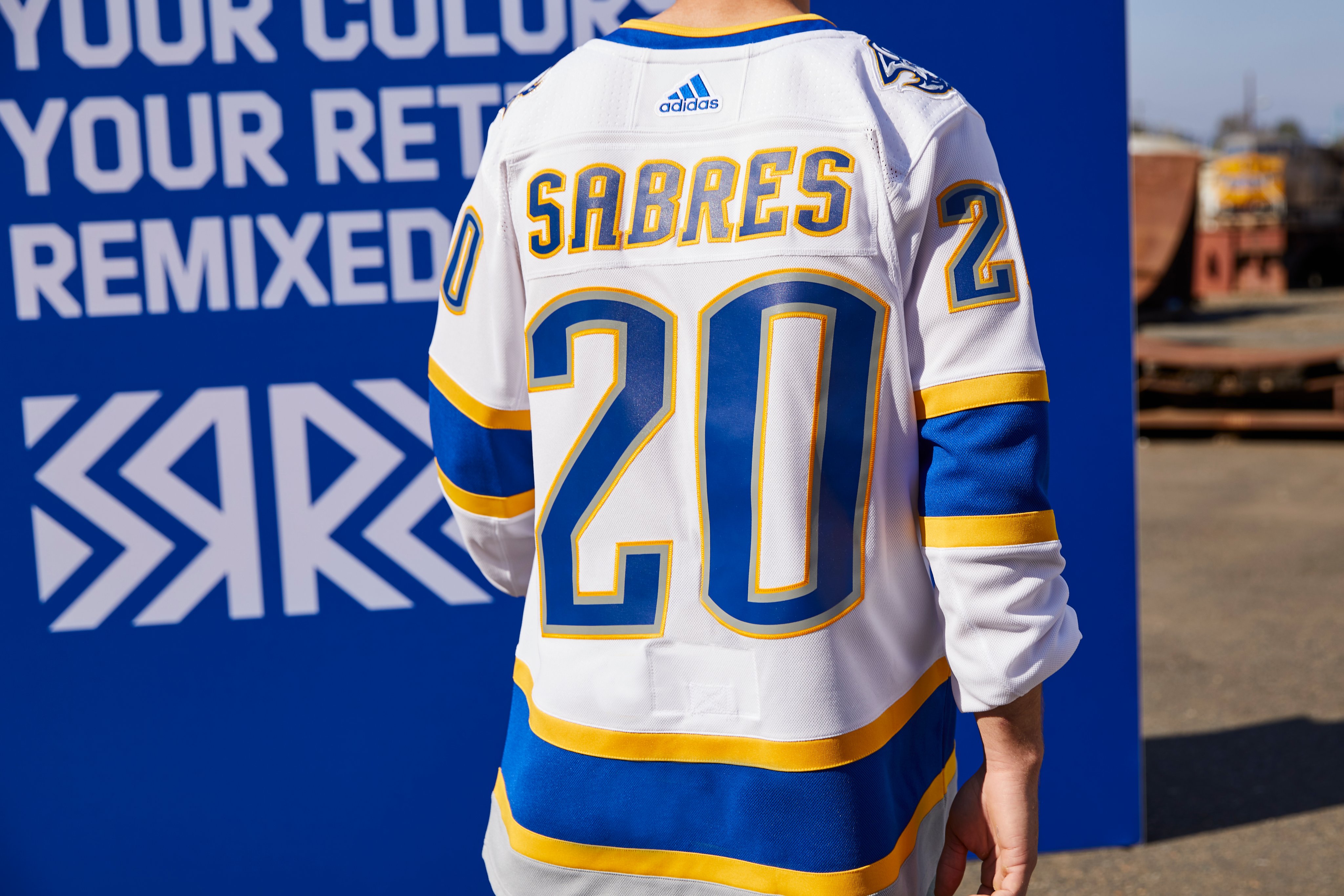
Our #ReverseRetro jerseys are modeled after the red alternate sweater introduced during the 2000-01 season and worn through 2005-06, with a royal blue twist. 🤩
Learn more: https://t.co/zBML8G5naU pic.twitter.com/SlbzkniuJm
— Buffalo Sabres (@BuffaloSabres) November 16, 2020
Talking about the front, the jersey is similar from what the team wore back in the early 2000’s but different colors, which can be seen below. Even though fans wanted the franchise to bring back the black and red combo,

I think the Sabres did a great job bringing back the past. I do love the crest as well. When I think of Buffalo Sabres hockey, I think of two things: blue and gold, and swords. I’m in love with this jersey and I can’t wait to get my hands on one.
Honoring the past with a focus on the future.
We're diggin' it. 😍 pic.twitter.com/bLg4OSCpU5
— Buffalo Sabres (@BuffaloSabres) November 16, 2020
Goat head
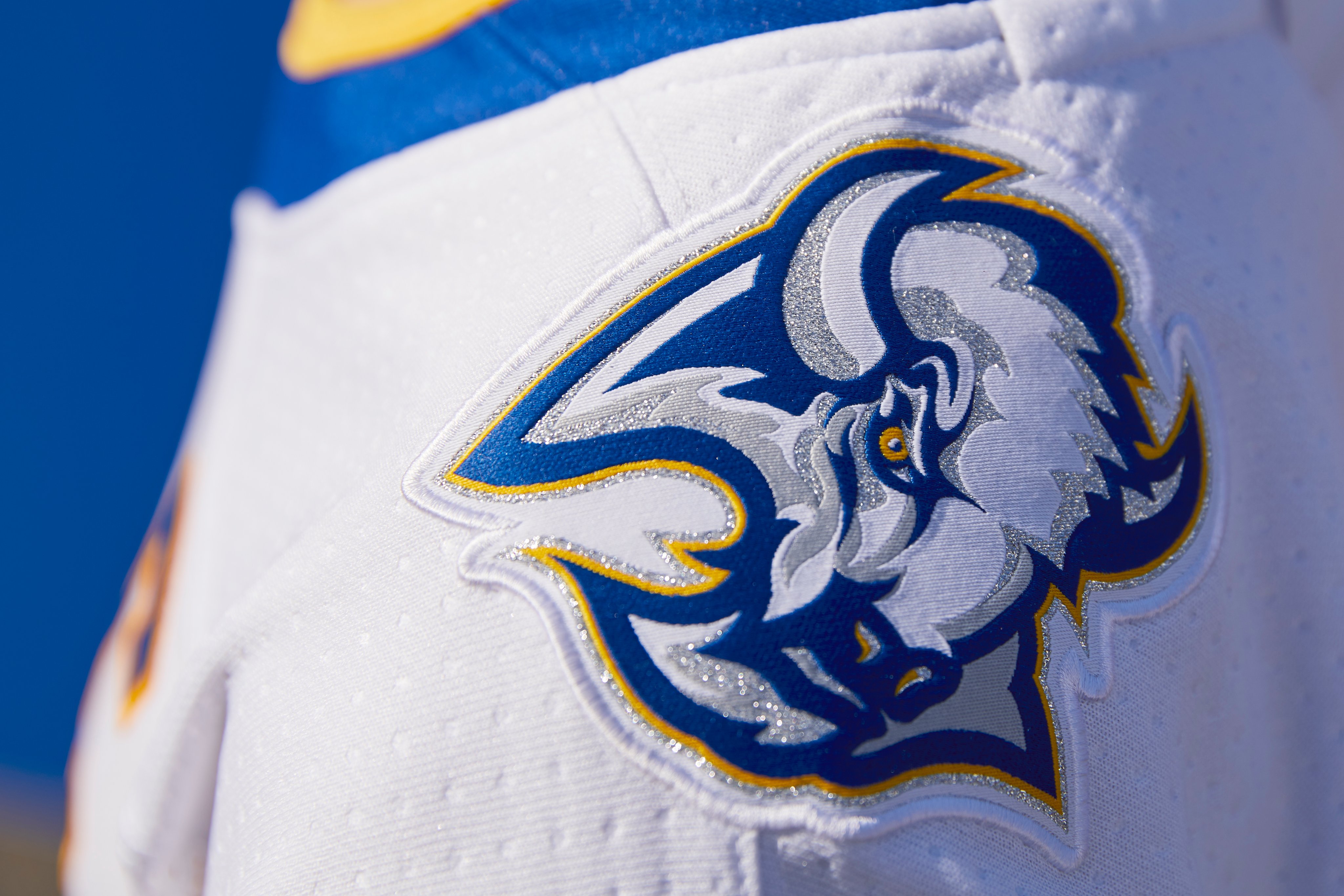
This is the part that really caught my eye. If you ask the majority of the fanbase about what logo is their favorite, you will hear “goat head” for the most part. I understand it’s a buffalo and not a goat, but that’s what people in Buffalo called the logo. Buffalo first wore the goat head jersey in 1996 and as I mentioned earlier, it’s a favorite amongst the fanbase. The blue and gold makes it even better and I’m so happy the team incorporated the goat head in this jersey.
![All The Buffalo Sabres Jerseys Ranked [LIST]](https://i0.wp.com/townsquare.media/site/10/files/2020/04/gettyimages-71023576-594x594.jpg?resize=560%2C373&ssl=1)
Font
The font is great as well. I love how it’s two different colors and not just one color. The lettering is what stands out to me the most.
Final Thoughts
In my opinion, I think the Sabres nailed it. I know it’s not black and red, but I am very happy with the jersey and if you look on Sabres Twitter, the reaction is good. Along with the new jerseys they released earlier in the offseason, the organization did a great job with the uniforms. Now hopefully, we can see a better team playing in those jerseys.
-Zach Jezioro (@ZachJezioro_13)